The Sea Lion, the Bridge, and the Pogrom
2025-05-14A new site logo has dropped: it’s a sea lion, sittin’ on a rock in the Bay, channeling Mr. Redding, with the Golden Gate Bridge in the background. It’s a reclamation of heritage, both personal and municipal. To understand what I mean by that, I need to explain its origins in a racist 19th-century rag.
Coöpting a Genocidal San Francisco
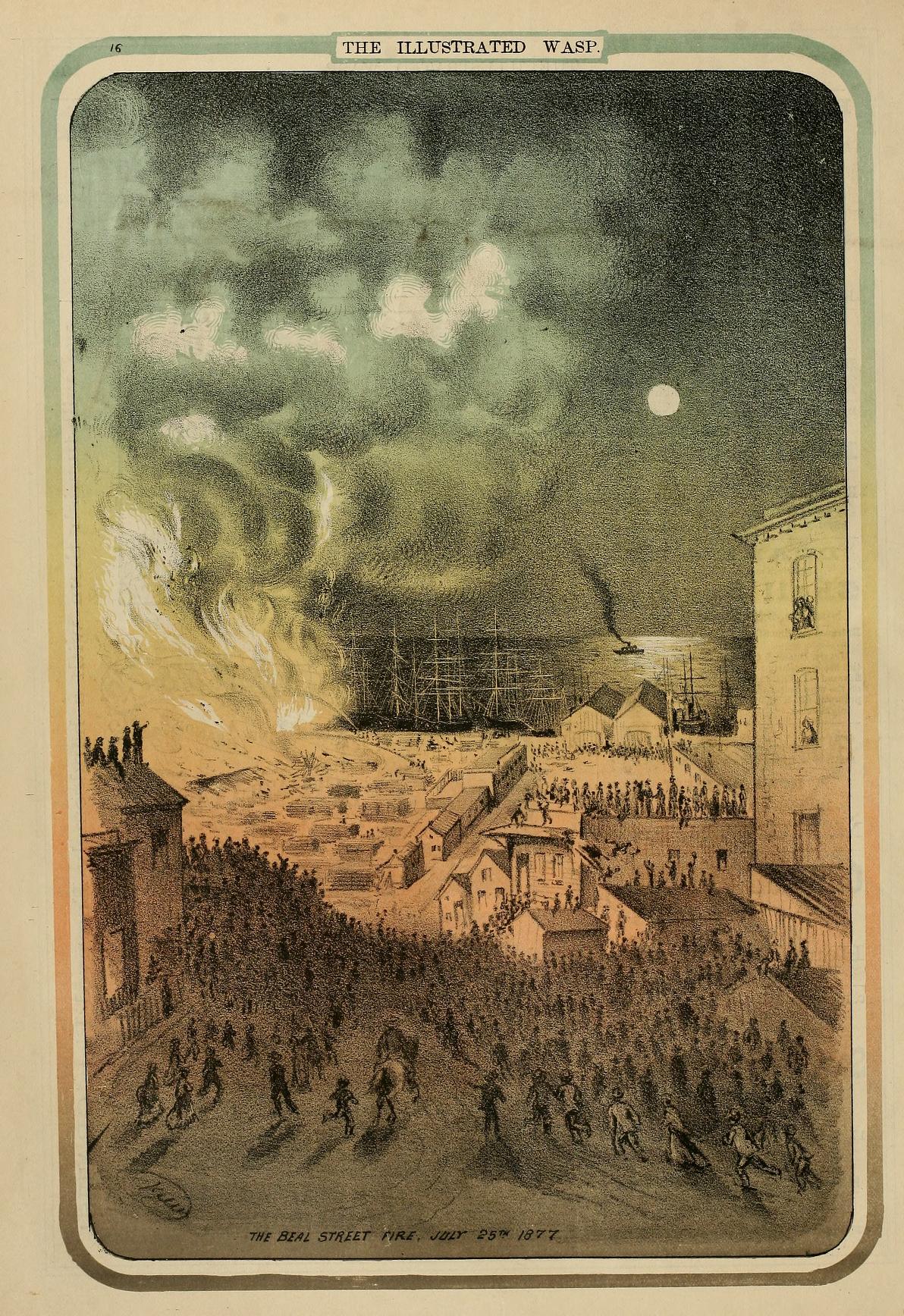
The new seal is inspired by the masthead of the 1884 The San Franciscan newspaper, a periodical so racist it openly called for the ethnic cleansing of Chinese San Franciscans in an 1885 editorial1. That was eight years after the anti-Chinese pogrom of 1877.
Now, in a more civilized time, it’s been revived in high resolution for 2025 by a Mexican of mostly Native descent living on Beale Street, the same street burned during that July’s anti-Chinese riot.
The best thing about remixing public domain art from a hella racist 19th-century publication? You get to turn it into something that’s meaningfully yours. This beauty’s now my trademark, unregistered for now, but I intend to formalize it.
The Great Seal
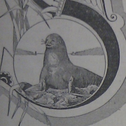
The seal’s seal, the animal at the center of both emblems, is a California sea lion, an unmistakably San Franciscan animal. Loud, social, and native, it far surpasses the (imaginary) phoenix and (introduced) parrots in earned symbolism. Only our brother and sister coyotes come close.
The Golden Gate Bridge in the background, with its engineering precision, nods to both San Francisco’s legacy of technical achievement and my own background in engineering. And, of course, there’s the visual pun of a seal on a seal. The emblem is layered and personal, like the site it adorns.
The Promise of a Utopian Future
The progress we’ve made as a city over the past 150 years gives me hope that the next 150 might do the same. That’s where Star Trek comes in. As a lifelong fan, one thing I love about this updated seal is imagining how it might appear another century and a half from now in that fictional universe, with Starfleet Academy on one side of the bridge and Starfleet Headquarters on the other. Speculating on that utopian future has entertained me for most of my life.
Art Deco and the SFPL
The Great San Franciscan Seal replaces the masthead logo I used on and off since 2011, itself adapted from the 1926 The San Franciscan magazine masthead. Although the design is beautiful and clean, I stopped using it when I decided the definitive article no longer matched my vision for this project. It may make a reappearance, perhaps for the 100th anniversary of the magazine next year.
This graphical interlude would not have been possible without the Daniel E. Koshland San Francisco History Center at the Main SF Public Library. It’s there that I found the predecessors to these fine artworks. Yet another reason to appreciate and support our wonderful public institutions and workers!
The San Franciscan. (1885, June 27). The Chinese must go (Vol. 3, No. 23, p. 2). ↩︎
— Your Correspondent accepts and appreciates Stripe Donations. —